current projects:
past startups:
concepts:
design and rapid prototyping:
iPAd 11-in stand
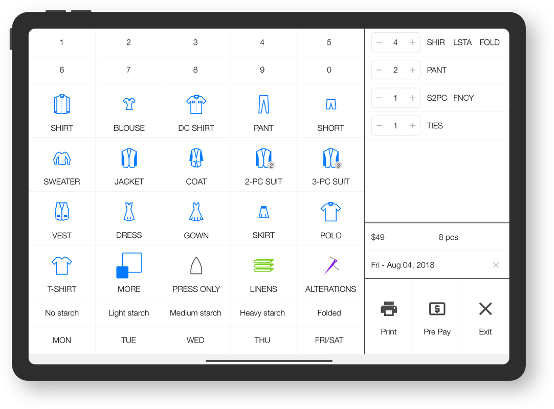
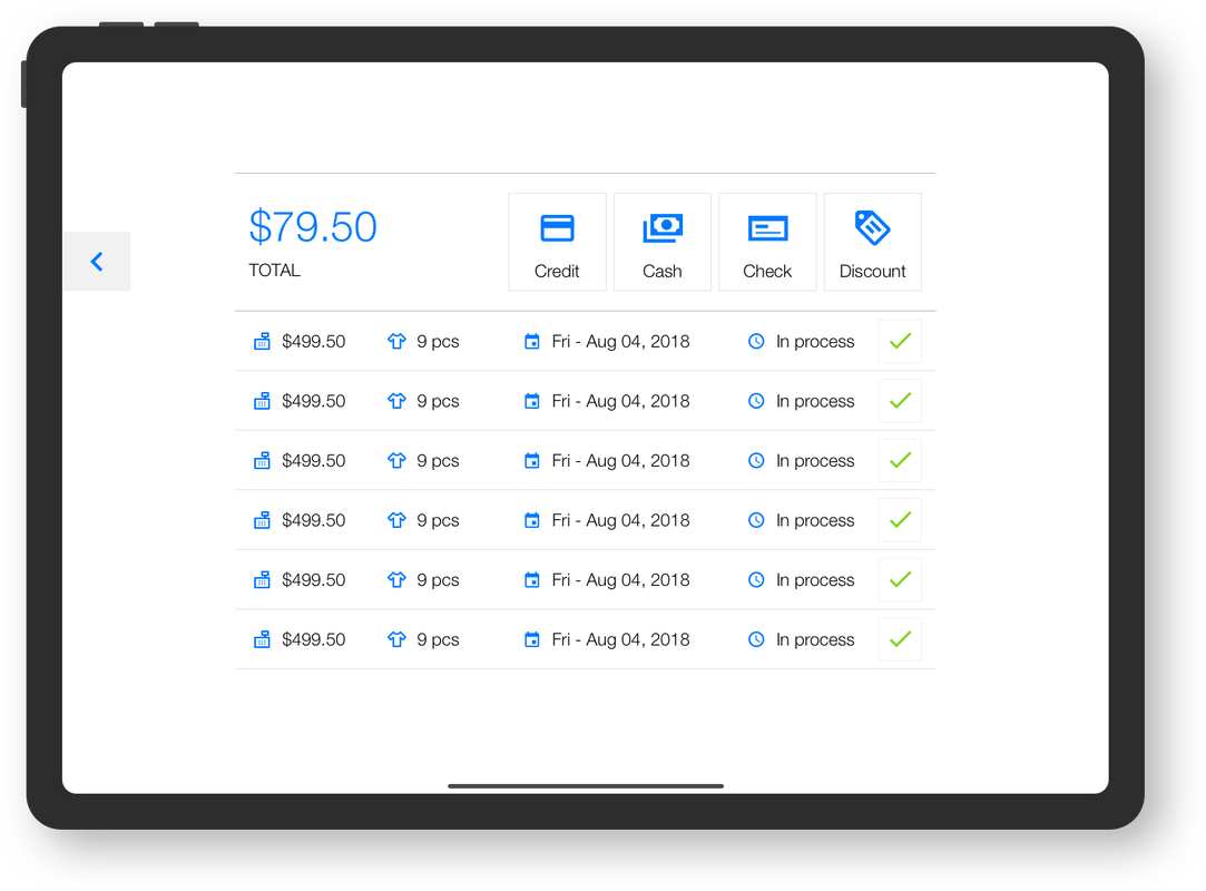
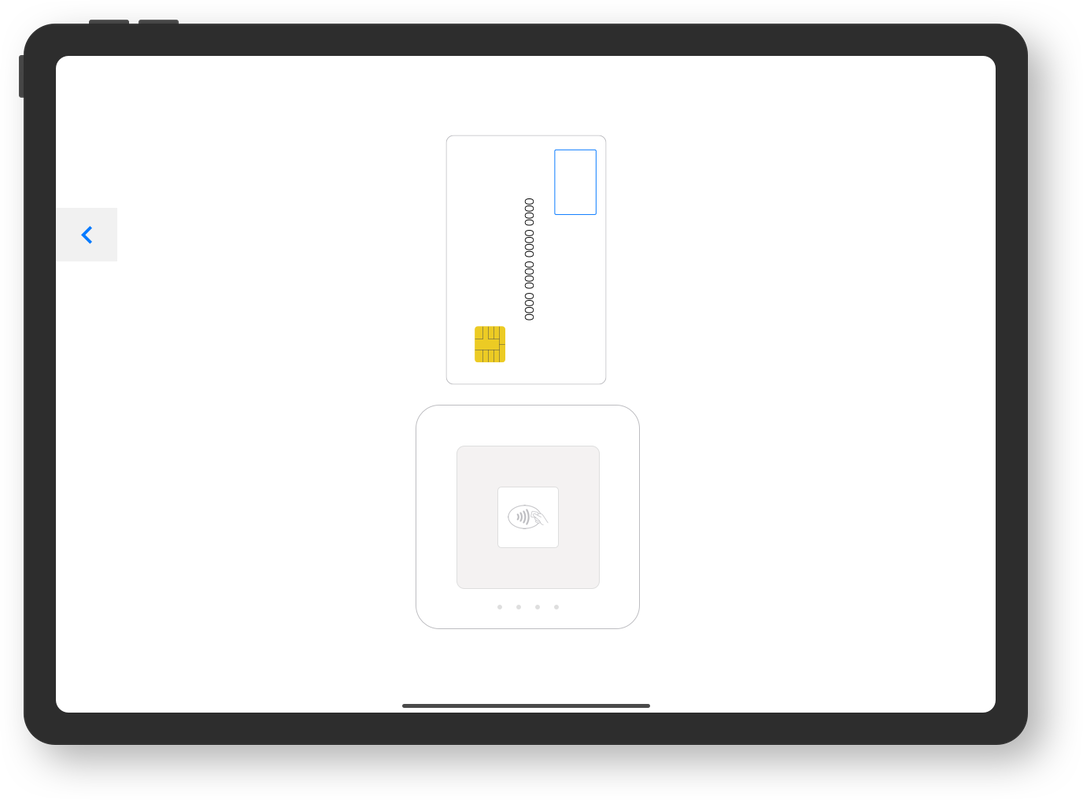
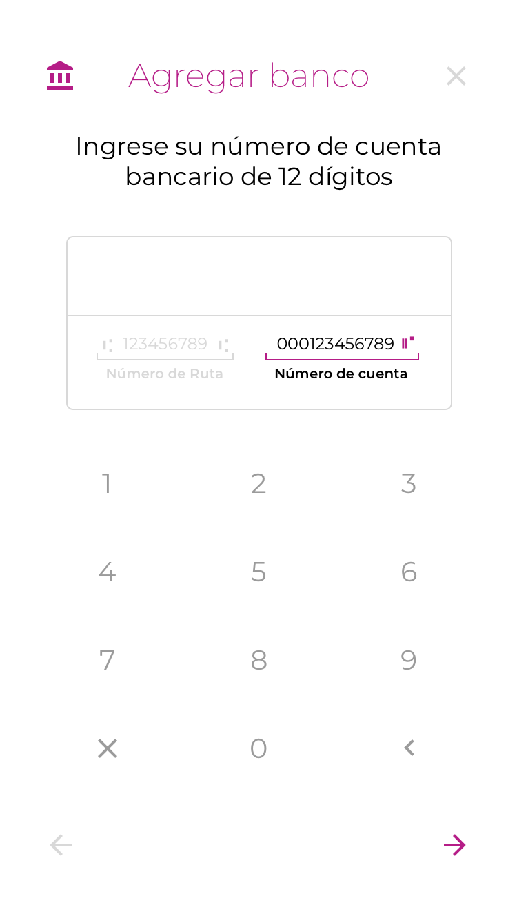
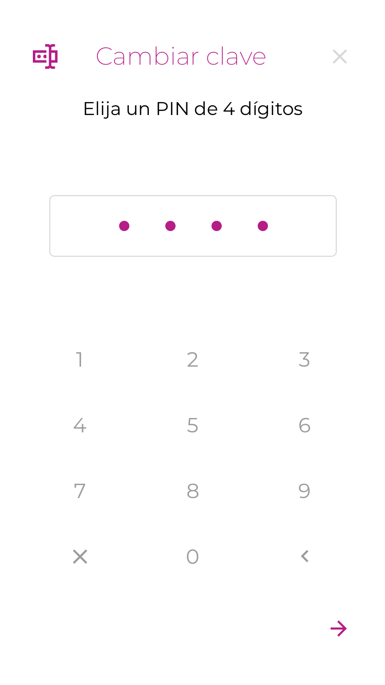
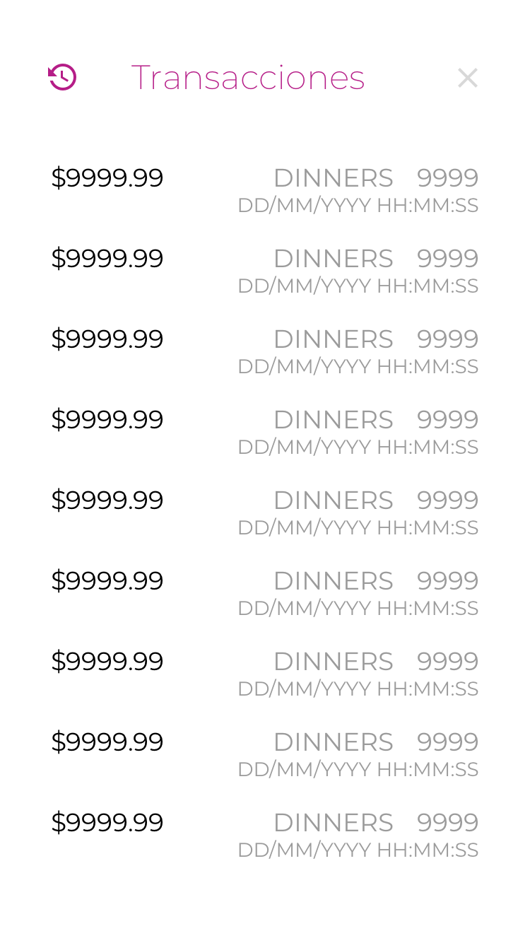
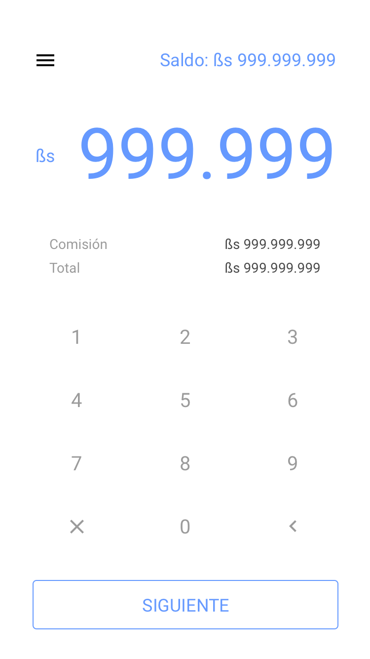
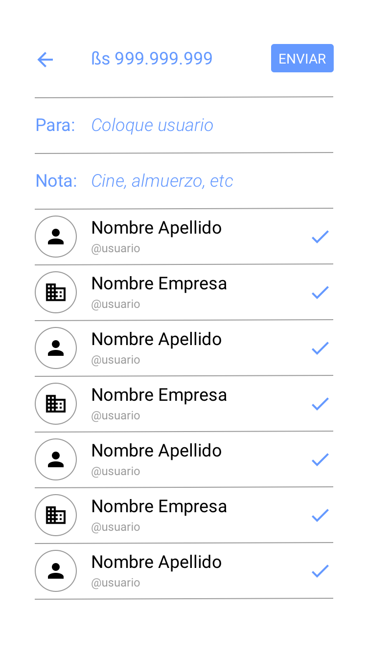
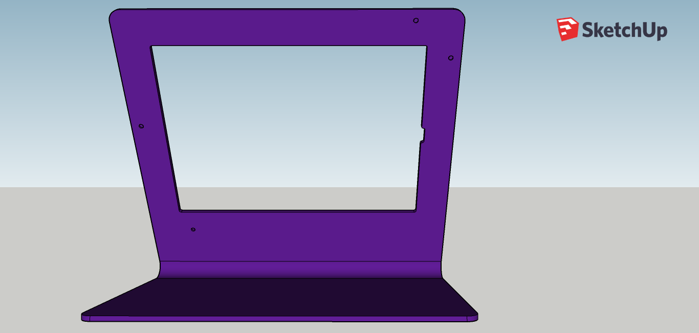
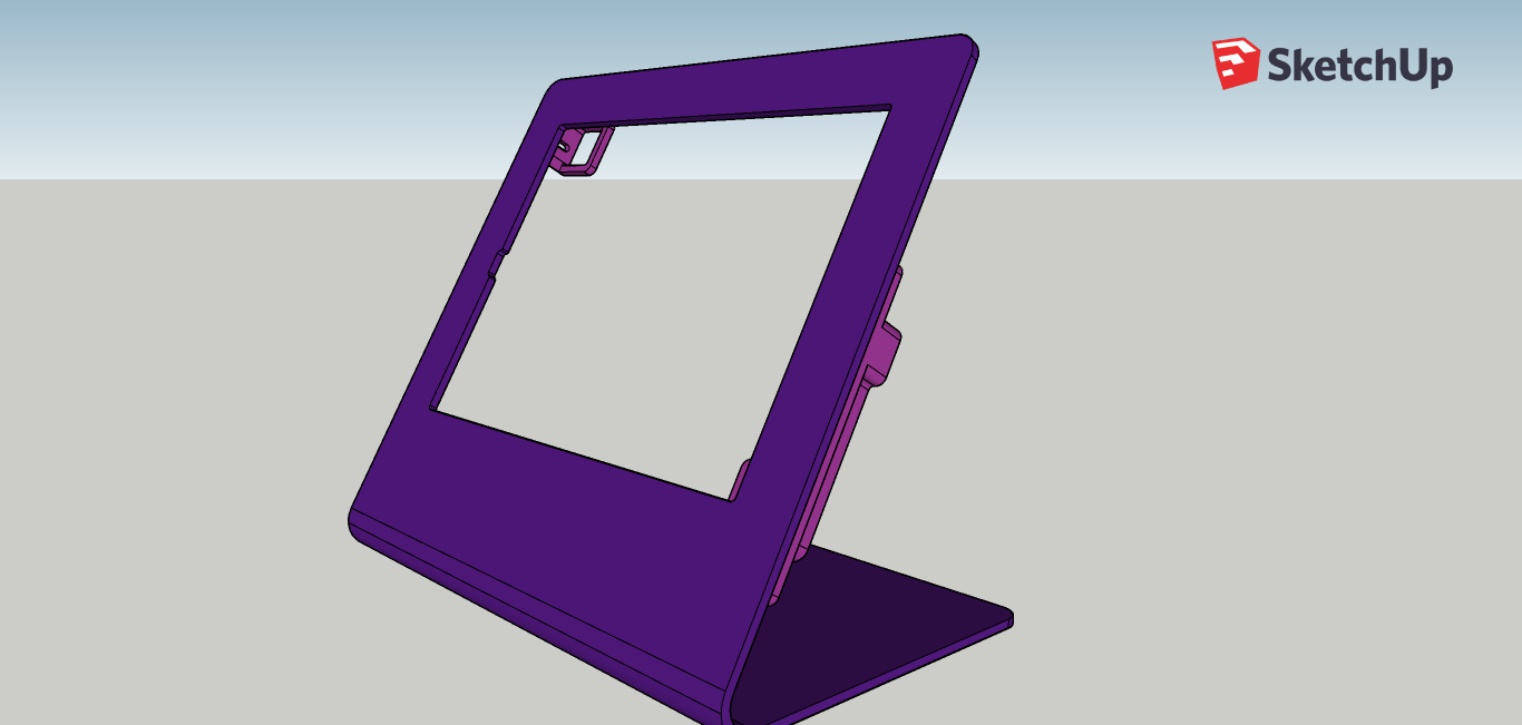
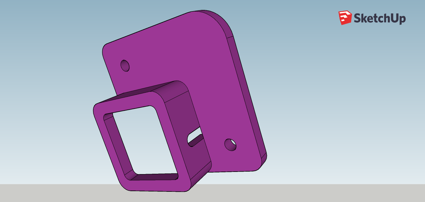
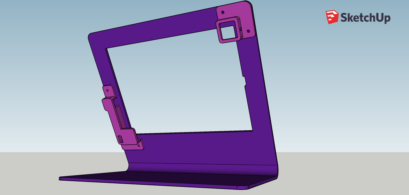
The DIN3RO app was designed for a iPad 11-in screen. However, because this iPad is so recent in the market that it was almost imposible to get a stand or a kiosk that work for it. Once again, creativity kicked in and I had to design one stand from scratch.
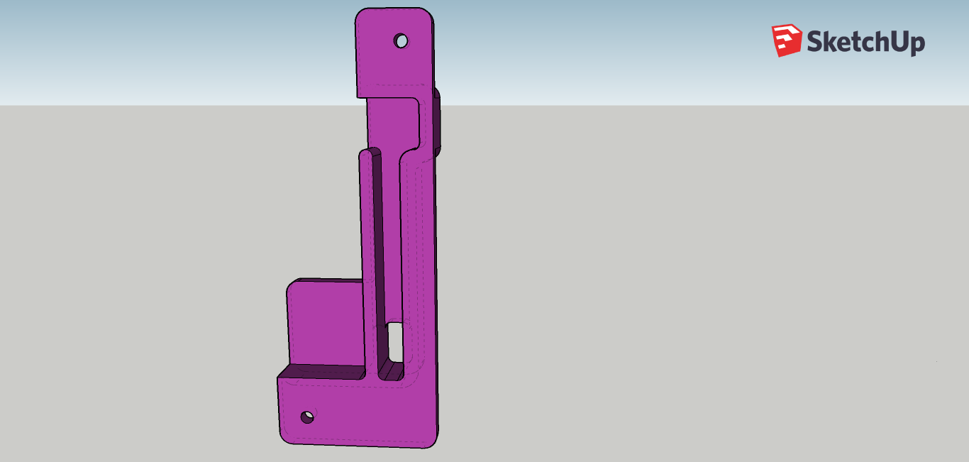
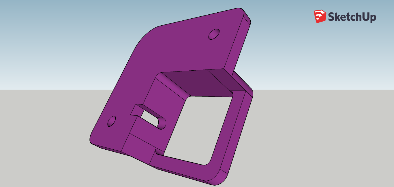
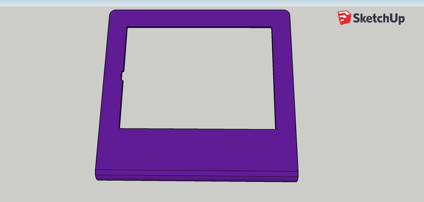
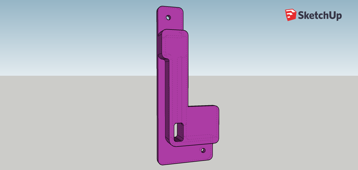
I developed the stand in SketchUp and did a few 3D printings to test that the measures were right. One important thing was to hide the cable connector to avoid people using for purposes other than the one desired.
These were the initial drawings:
I developed the stand in SketchUp and did a few 3D printings to test that the measures were right. One important thing was to hide the cable connector to avoid people using for purposes other than the one desired.
These were the initial drawings:
PRODUCT MANAGEMENT:
GOLDEN CORRAL CASE
As an entrepreneur and consultant with vast experience in high tech and management. I spot things and I take note as it is my nature.
On June 26, 2015 I visited Golden Corral with my family. As usual everything went well. However, I spotted multiple issues to their customer service's processes that can be easily fixed to maximize savings and efficiency.
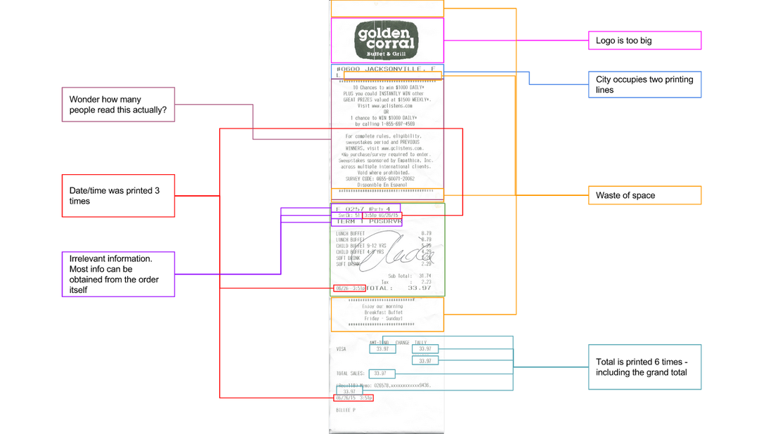
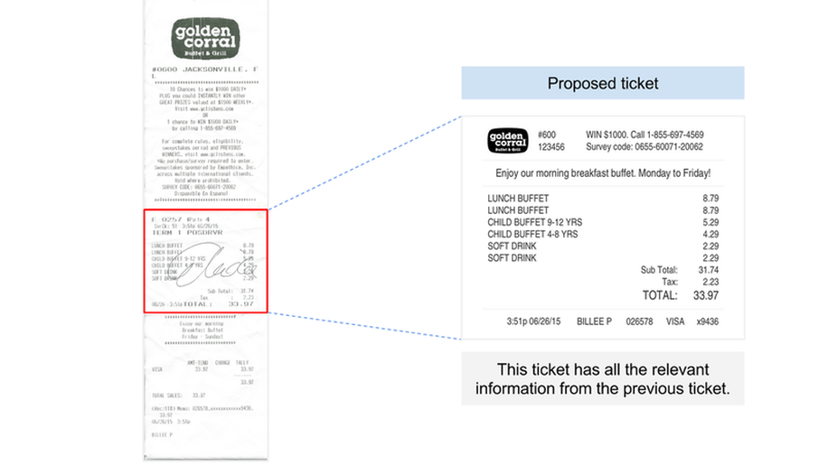
One of those issues was the length of the receipt. It is way too long - Check below for pictures. My ticket was 18 inches long and the relevant information was less than 3 inches tall. Assuming that Golden Corral has over 650 stores and that they print thousands of receipts a day, saving 80% on paper could save them millions of dollars in the long run. This is an easy fix that doesn't require extra money to be implemented. Even a simple question as - "Do you want your receipt?" - may push people to say “No” increasing the savings.
So, why they didn't do it so far? Did anybody spotted this before? What are the other things that I saw that can be also fixed? Any ideas?
What about overhauling the restaurant's experience with high tech - apps, tablets & wifi - that brings and retains customers. Similar to what Starbucks, Chilli’s, Panera and Whole Foods are doing.
This is the receipt that I got:
This is the proposed ticket. 80% smaller and with the same relevant information than the previous ticket.
startup colaboration:
STACHE.COM
I contacted a startup on Craigslist looking for a business opportunity. I found out they are like Airbnb.com but to storage stuff in somebody else's house. I really liked the concept. As rule of thumb, I never get involved in any startup that I won't use. And I have to say that I would've used this several times if I knew they existed.
I moved twice in the last two years. One of them from Jacksonville, FL to Miami, FL. I just rented a storage and moved. I would pay to storage stuff at a friend's house. Also, from 2009 to 2016, I owned a house and I had tons of space to rent away.
They pivoted to help a friend and they are - to my opinion - in the right path - after talking to Mike - their CEO. But from the user standpoint - which is the area that I would like to talk about - there are many things that can be greatly improved.
The actual site prompt you to put an address to find the closest host. If you have none nothing happens. In a world where data is the king it is a good idea to know who asked for which address, so you can make a plan on those areas. Maybe contacting those early adopters to become part of the team and help Stache.com expand.
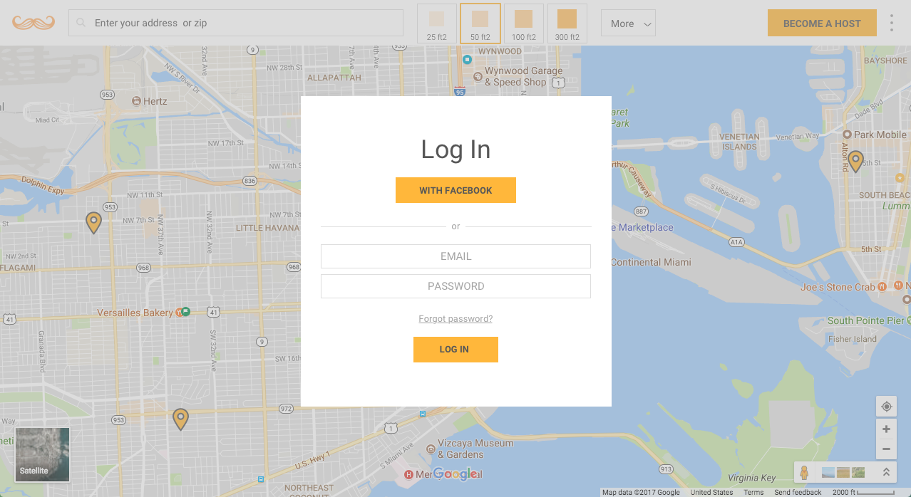
The following landing page prompts you to log in before doing anything. But it is smart enough to show you "something" before you enter so you don't feel tricked into it.
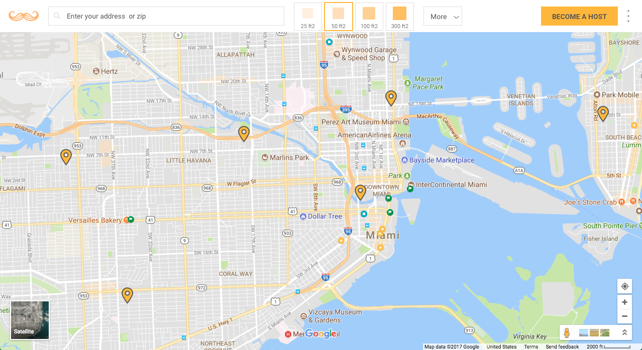
Once inside, I will recommend to auto-find the location of the user and provide a full screen map.This will make the screen look less clogged than what it is right now. Allowing to make a easy span of where in town is this needed, creating opportunities among its users.
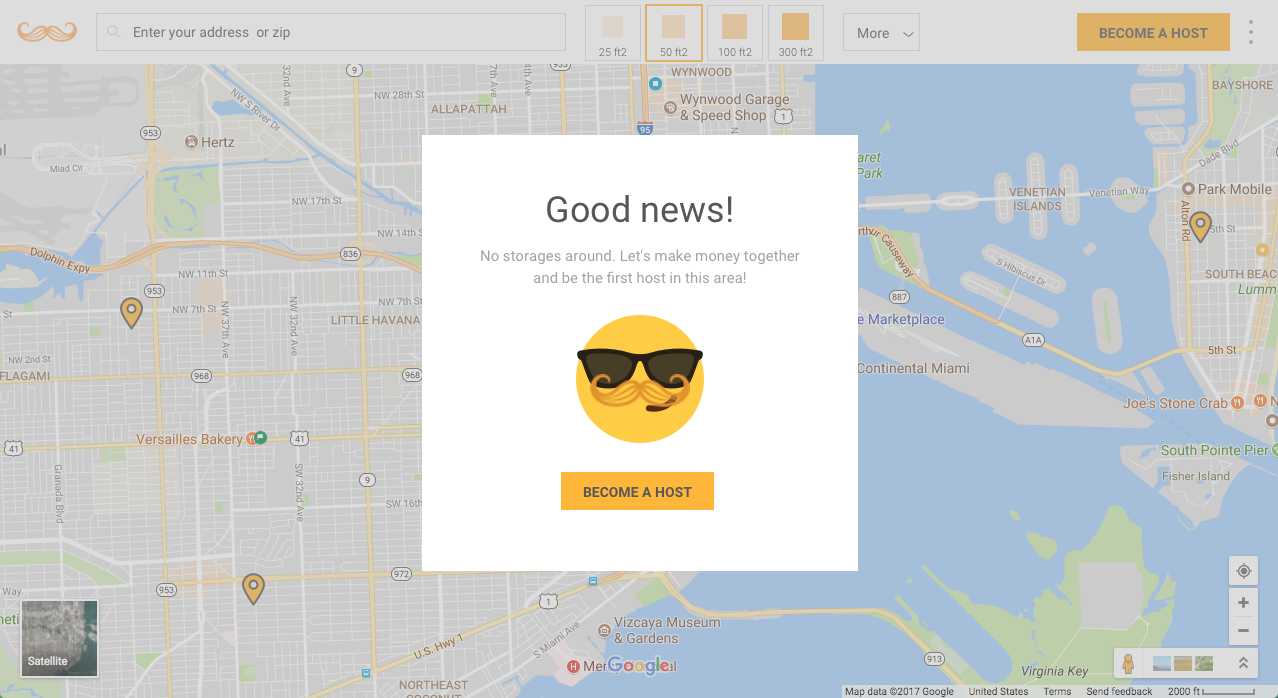
If no hosts are close, prompt the user to become a host in a positive way instead of telling them that one ones is available around.
In short, I think that the service can be highly improved if they change their UI/UX. These efforts would be way more effective if they are designed with the end user in mind - allowing the simplicity, design and functionality work by itself. The system needs a way to share this service among friends, this will create a virality and therefore an increase of revenue.
A Product Manager can help to ease this task as it can gather information and transform it to an easy to implement idea interacting with engineers and Management to make what the user want.
THE HUNT
On August 8th 2017 - a week after I moved to sunny Miami, FL, I was introduced to a clever startup called "The Hunt".
The Hunt is an app that uses AI to identify objects posted by users that want to find and buy the item online. Basically, this site is a hybrid between Google Images, Google Shopping and - of course - Pinterest. What really called my attention was its established and returning user base - which is actually growing and that feels like a social network.
I was asked to make an assessment of my vision of this tool - what can be improved and what else can be done to increase revenue or its user base, which I'm happy to do!
Of course, as Product Manager there are many things that I see that can be achieved by changing the design itself, its process, minimize the amount of clicks and redounding information displayed, to keep the information relevant in the users' hands. However, to simplify my ideas, I just want to focus on a few basic points from the landing page and not the mobile apps or the business side in detail as I don't have enough data.
My recommendations are not definitive in any way, but just a plain view from my stand point. I recommend:
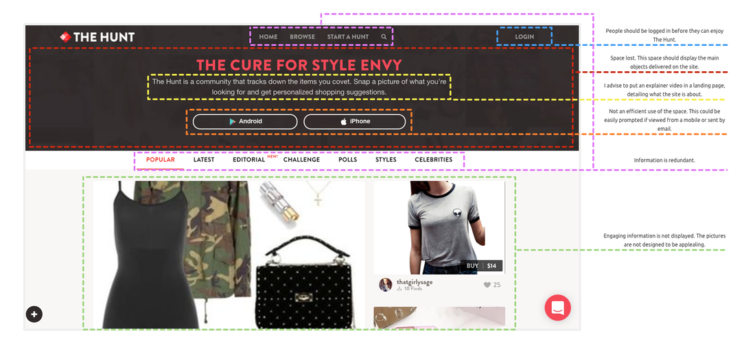
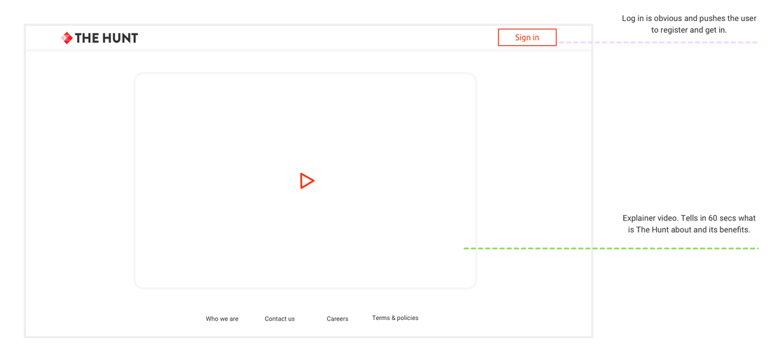
Landing page - The main objects are not in plain sight. The site was not designed for all sizes of screens.
The landing page should be just to inform the benefits of being on the Hunt in an easy way and prompt the user to log in to try it out.
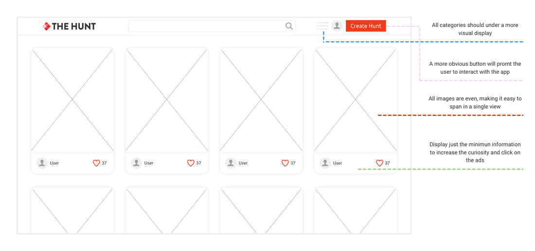
The site can be improved greatly focusing all efforts in the user experience. With a minimalistic design and a cleaner site, the user engagement could be increased prompting the returning usage and eventually closing a sale.
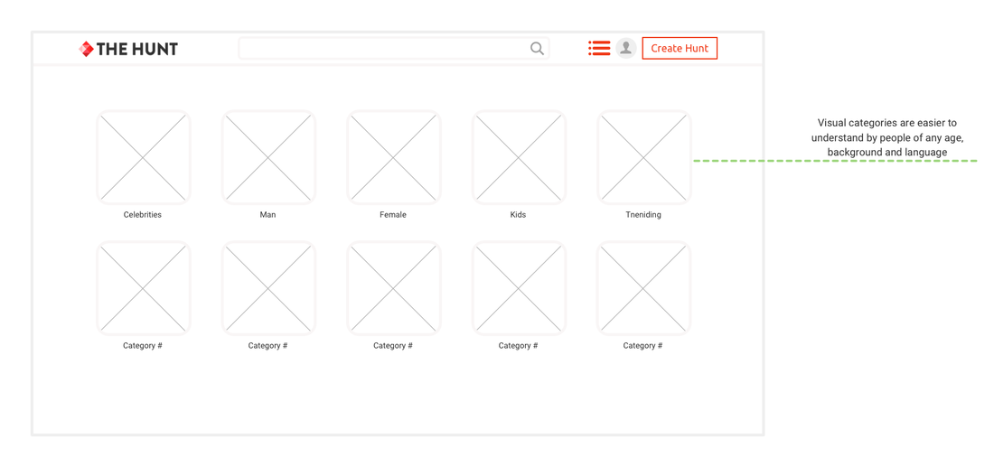
Using visual categories are highly encourage. These are well accepted regardless of the language used by the person interacting with The Hunt, age or computer literacy.
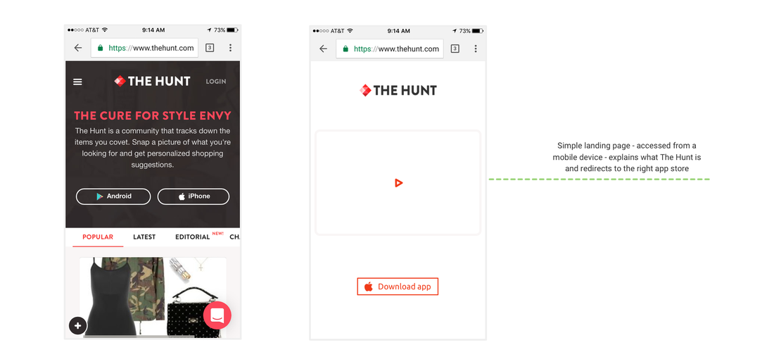
The landing page through a mobile device should auto-detect if the user is using an iPhone or a Android to redirect them to the appropriate app store to download the app.
To design a plan to deeply evaluate the whole startup, its services, to determine how can be improved and how to find other verticals to monetize it, I'm going to need a longer period of research and use of its data.
However, my best gut approach is that this tool have a real chance to be acquired anytime soon. All efforts to increase its value at this point are really recommended.
However, my best gut approach is that this tool have a real chance to be acquired anytime soon. All efforts to increase its value at this point are really recommended.
